In my spare time, I created a design proposal to improve the contrast ratio of the Heroku's color palette in order to make the product more accessible for low vision users. I shared the proposal with a few developers that understood the value of accessibility and we all decided to make it happen as a volunteer effort in our spare time from our assigned responsibilities.
In less than a year, our grassroots project managed to compel leadership to prioritize accessibility work and fund it in our team's yearly charter.
This is a story about how embracing a beginners-mind and practicing one's values can lead to important positive impact. It's also about the struggles of introducing change in an established product, worsen by going rogue and not following due process.
Background
When I joined Heroku in 2018 the first thing I noticed about the product was that the colors were quite dull and lacked enough contrast to ensure they were legible by all our users. I quickly started advocating for an update of our color palette. Nobody was against it, but it wasn’t a high priority so it never happened. Once I felt more empowered in the company and learned more about accessibility and Salesforce’s pledge to making all its products accessible, I decided to create a proposal to address the issue.
1. Problem
Heroku Dashboard had around 300 elements that didn't meet the minimum luminance contrast ratio, decreasing legibility for everyone, and especially for low vision users.
Goals
Reach Level AA for luminance contrast ratio as defined by the internationally recognized best practices of the Web Content Accessibility Guidelines (WCAG) 2.0. This ratio guarantees the legibility of text against its background, in order to ensure all users can perceive user interfaces equally.
Needs
Users
This benefits people with color-vision deficiencies (like Deuteranopia or Protanopia which affect 7 to 12% of men), age-related low vision conditions (like macular degeneration or diabetic retinopathy), and those with presbyopia, the natural aging process of, well, needing glasses. These conditions reduce sensitivity to contrast, and in some cases reduce the ability to distinguish colors.
Business
Minimize legal risks by meeting all legal accessibility requirements across the world and extending our market reach to industries like government, education, and health which require a high level of accessibility for its users. A company whose products and services are more accessible allows for more inclusion and participation in its ecosystem.
Constraints
- No dedicated team. Everyone who collaborated on this were assigned to other ongoing projects that took priority.
- No time allocation for this project, we worked on it sparingly during our work week when we had time.
2. Approach
"Equality is accessibility. If you don’t have accessibility you don’t have equality."
— Marc Benioff, Salesforce's founder, chairman, and co-CEO
The web is an ideal place to ensure the principles of universal design, as it breaks down barriers and enhances capabilities that the physical world can't or struggles to provide. As with any good design, its value comes from a conscious and proactive decision and effort. We, as professional designers and developers, must decide to build accessible products.
Audit
My first obvious next step was to perform an audit of our existing color palette. We used Contrast Grid to map out all the possible text and background color combinations the color palette could offer.
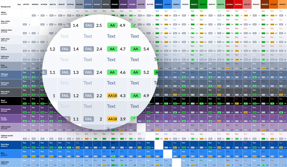
We only use a very small percentage of color combinations from that grid but it was a helpful tool to quickly see which combos reached the minimum contrast ratio and which didn’t.
Design Proposal
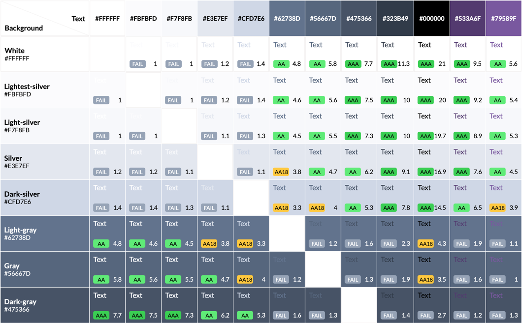
I then listed all the combinations that needed more contrast and proposed new colors to meet the minimum. These are just a few examples of the proposed changes.


In order to keep a consistent selection of shades from the same gray hue, we realized that we needed further changes to the palette. So we ended up changing two other tones and getting rid of one, since a darker starting point meant less noticeable variation.
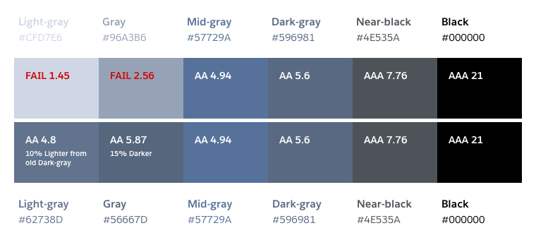
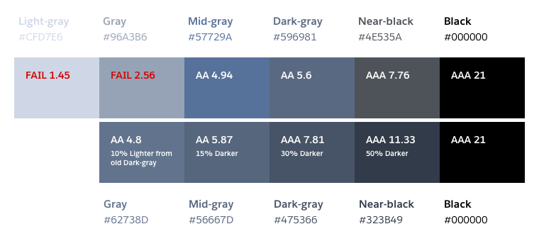
I proposed several other changes on the complete grayscale palette, like getting rid of colors, defining which colors could be used with a light or dark background or changes in names.

These changes gave us a solid, consistent, and above all, accessible color palette for our product.
Pivot
Once we began the implementation planning process we realized how much overhead all these small changes added.
And how long it would take to implement them on all our product, websites, and other marketing graphics. We then decided to scope it down and I came up with a second proposal.
This new one kept the changes to the darker grays but didn’t remove any color or change any name — it maintained unnecessary colors and inconsistent names but solved our accessibility concerns with a time investment we could afford.
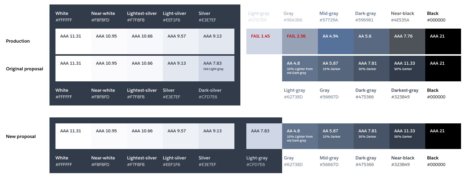
Once we had taken the time to audit each of our GUIs and we were confident we hadn’t regressed legibility in any areas, we rolled out the change to customers. In the end, a mix of solid research, theory, tools, and attention to detail got us to where we wanted to be—a GUI that is every bit as elegant as before but now markedly more accessible.
3. Output
The new color palette has been rolled out across all of the Heroku Dashboard.
When you visit any page in the Dashboard, you will find improved color contrasts that are a result of the work that has been done. While it can be hard to discern the improvement in legibility from one day to the next, the impact is much easier to spot when looking at the before and after interfaces side-by-side.
Below are two identical screenshots of the Spaces section of the Heroku Dashboard with the old colors on the left and the new colors on the right. Note the darker gray (1) and blue (2) text.

The screenshots of the Dashboard below show the impact of increased color contrast on other elements beyond text such as badges (1) and icons (2).

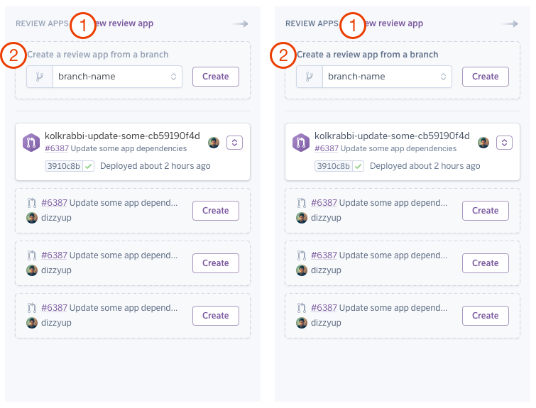
Our color palette changes are reflected equally in mobile browsers, where small screen sizes and lower resolution can present additional challenges to legibility. Below are before and after examples of our review apps page in a mobile browser. For example, compare the "Rreview Apps" (1) and "Create a review app from a branch" (2) texts.
4. Outcome
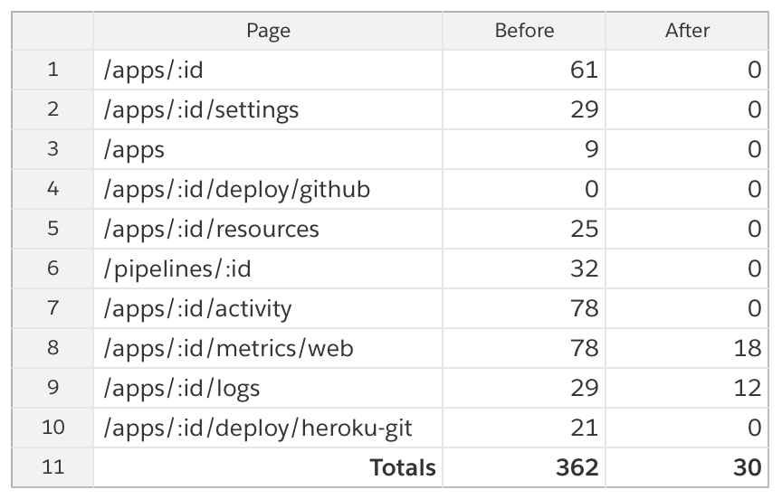
The number of color contrast violations in our GUIs dropped an order of magnitude.
It’s not always easy to predict how the components of a design system will end up being combined in practice, especially in a large app with many features added over many years. We had to ensure we were improving the legibility of common elements such as form labels, notifications, and warnings, but also more exotic elements such as our metrics charts. For the most part, we were very happy with how the improvements worked in practice and were even happier to see the number of color contrast violations in our GUIs drop by an order of magnitude.
Impact
- We were proud that Heroku's Dashboard is now more legible by people with low contrast sensitivity or color blindness, that it is more legible in different lighting conditions, and that it is easier to read by everyone.
- In order to avoid contrast violations in the future, our Front End team decided to include ember-a11y-testing, a tool that plugs into Ember’s opinionated testing framework and makes it easy to run an accessibility audit (powered by industry-standard axe-core) at key moments during acceptance tests. If we were to introduce an accessibility violation (for example, insufficient color contrast) then the test will fail and tell us exactly what we’ve done wrong.
Learnings
- We all learned more about accessibility and the details of the WCAG contrast requirements.
- Brendan and I had just joined the company a couple of months before. This was a great project to learn about all the Heroku entities and purple3, Heroku's Design System. We learne d the complexity behind them and how inconsistent we were at consuming purple3.
- Broad changes to a complex established product are really hard to land.
- Not including the Product team earlier was a mistake. We were lucky they understood the importance of the project and that we had already done a lot of work, but questions were raised about what we could have done in lieu of this.
- The importance of a proper project plan (budgeting time, dedicated team, product roll out, updating the changelog, company comms, etc.)
- Because of the above, our initial scope was waaaaaaaaaaaaaaaaaaay off.
- That finding a nice-looking orange color with enough contrast ratio is Mission: Impossible 14.
Accomplishments
- We shipped the changes and were able to turn a grassroots project into a formally managed project.
- This project raised and reinforced awareness of the need for accessibility improvements.
- It drove attention to the Heroku Accessibility guild from leadership. This project served as a success story for product accessibility in the company.
- We wrote a blog post about the project, which was a great public-facing story to tell.
- This project was only possible thanks to a great cross-team collaboration and the team's passion for building accessible products.
- Improving the accessibility of Heroku became a top priority for the Product and Engineering team and was included as a funded project in the team's yearly charter. The company invested in a Voluntary Product Accessibility Template (VPAT) audit by a third-party which gave us an exhaustive list of accessibility issues to address. I'm extremely proud to say the team has fixed most of those issues since then and now everyone can see Heroku's Accessibility Conformance Report on the Salesforce site.
Takeaways
- Involve Product from day 1.
- Prioritize communicating this type of work internally (surface it during planning meetings, announcement email...) and externally (changelog, blog post).
- Creating change through grassroots initiatives has its downsides, but sometimes it's what an organization needs to create momentum on things that matter.
Feedback from colleagues
It’s taken a day or so for me to adjust to the new normal, but wow, the accessibility improvements are so subtle and yet make reading the dashboard much easier. I didn’t realize how much I was adjusting to the paler shades of grey before.
– Stanley Stuart
I am incredibly proud to be associated with this work.
– Jamie White
